The U.S. Government Is Our Biggest Creditor and Other Statistics
The Federal Reserve Bank of Philadelphia’s Payment Cards Center Consumer Statistics page keeps us up-to-date on the latest data and trends related to consumer credit payments. It is an indispensable resource for those of us who keep track of the evolving consumer credit landscape. Yes, we do have many other sources of data to turn to, including ones maintained by other Federal Reserve outfits (not least the G.19 report), but the Philadelphia Fed is doing all the heavy lifting and crunching of raw data for us, so we can save some time.
So today I thought I’d share with you the Payment Cards Center’s latest snapshot of consumer debt, credit performance, and supply and demand of credit in the U.S. ?áFor the most part, you’ll find the picture it paints quite familiar and something we’ve grown accustomed to in the post-Lehman world. However, there are two graphs, which I think will draw the attention of many of you. And not because we’ve been ignorant of the trends they illustrate, but rather because of the sheer scale of the underlying shifts that have occurred and are still under way. I’m talking about the huge increases in the holdings of consumer debt that belong to the U.S. government and government-sponsored enterprises (GSEs). Let’s get started.
How Much Do We Owe?
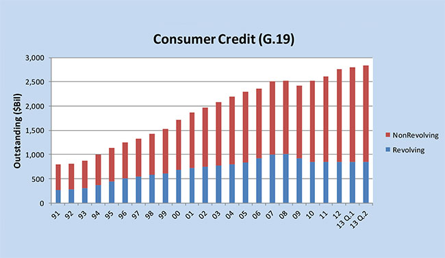
The total amount of outstanding consumer credit is broken down into two categories in the Federal Reserve’s G.19 report: revolving and non-revolving credit. The former category is comprised almost exclusively of outstanding credit card balances, while the latter is a mixture of student loans, auto loans and loans for mobile homes, boats and trailers, but not including home mortgages and loans for other real estate-backed assets.
As you can see in the chart below, whereas revolving credit decreased quite a bit in the first two post-crisis years and has remained flat since then, the non-revolving portion of the total didn’t fall nearly as steeply and then it was much quicker to rebound. As a result, aggregate consumer credit has been rising steadily since 2010.
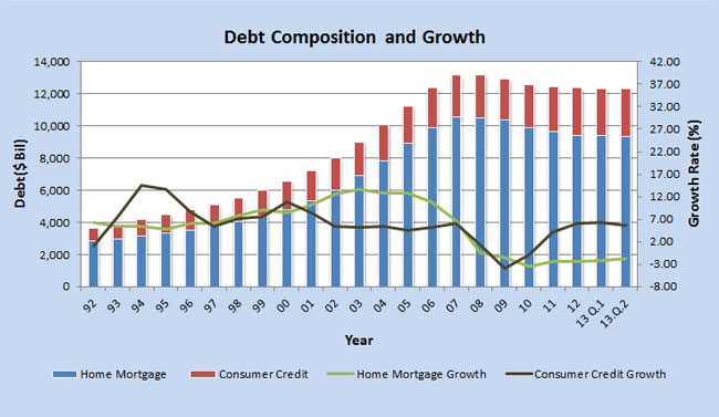
The Federal Reserve Flow of Funds Accounts (the Z.1 report) gives us data on debt growth and debt outstanding in several sectors. Below is the chart for the growth of home mortgage and consumer credit.
How Much Have Charge-offs, Delinquencies and Bankruptcies Fallen?
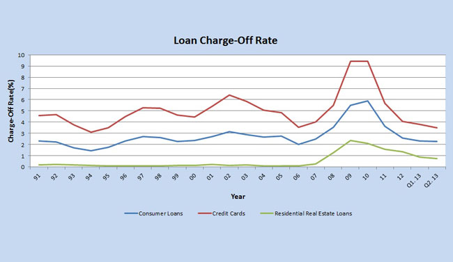
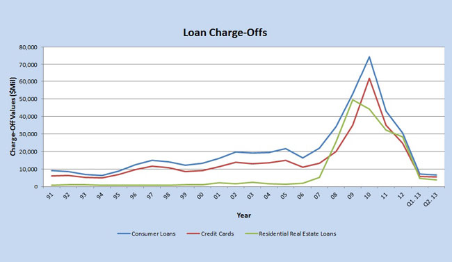
The Federal Reserve Board calculates its charge-off statistics from data available in the Report of Condition and Income (Call Report), which is filed each quarter by all commercial banks. For any loan category, charge-off rates are defined as the flow of a bank’s net charge-offs (gross charge-offs minus recoveries) during a quarter divided by the average level of its outstanding loans over that period. Here are the charts for the charge-off rates and volumes for each of the major consumer credit categories.
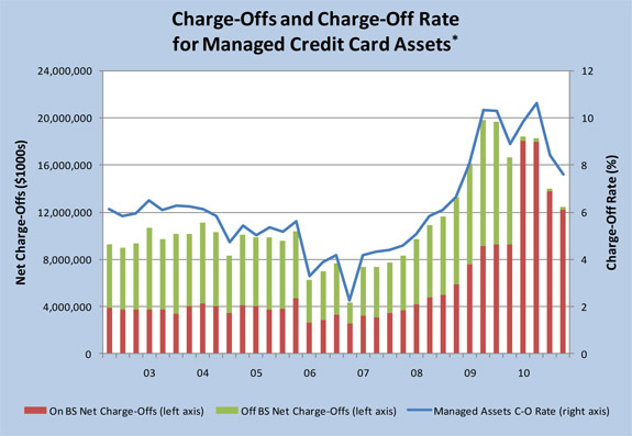
The chart below is derived from data available in the Call Report mentioned above and represents the shifts in the charge-off rate, calculated by dividing the sum of on- and off-balance-sheet credit card net charge-offs (gross charge-offs minus recoveries) during a quarter by the on- and off-balance-sheet total amount outstanding for the end of the previous quarter.
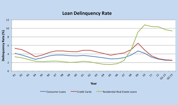
The Federal Reserve’s Board calculates delinquency statistics, once again, from data available in the Call Report. The delinquency rate for any loan category is calculated as the ratio of the dollar amount of a bank’s delinquent loans in that category to the dollar amount of total loans outstanding in that category. Here are the charts for the delinquency rates and delinquent volumes for each of the major consumer credit categories.

Bankruptcy filings are measured using statistics from the Administrative Office of the United States Courts. The chart below illustrates the sharp decline this year in the bankruptcy filings by non-business entities. The surge of bankruptcies in 2005 was due to the Bankruptcy Abuse Prevention and Consumer Protection Act (BAPCPA), which went into effect on October 17, 2005.

How Much Has Demand for New Credit Increased?
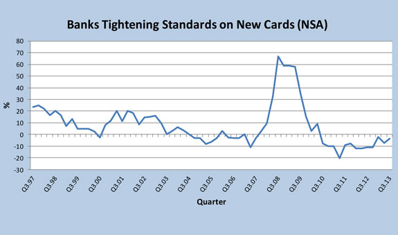
The data used to keep track on banks’ credit standards and demand for consumer loans come from questions asked by the Federal Reserve in its Senior Loan Officer Opinion Survey (SLOOS). Surveyed are about 60 large domestic banks and 24 U.S. branches and agencies of foreign banks. Questions cover changes in the standards and terms of the banks’ lending and the state of business and household demand for loans and some other topics. As you can see in the chart below, following a big tightening in the immediate aftermath of the financial crisis of 2008, U.S. banks have relaxed their lending standards, which are now looser than they were in most of the period before the meltdown.
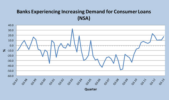
The loosening of the lending standards has coincided with an increase in demand for consumer loans, which is now approaching the peak level reached in 2003.
Who Owes What?
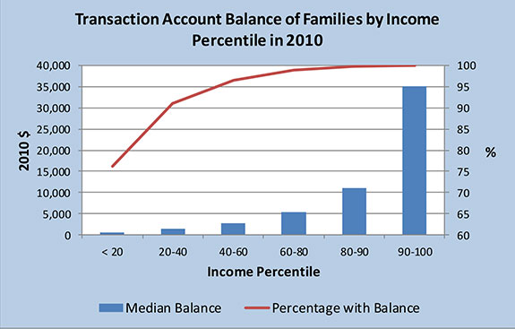
The triennial Survey of Consumer Finances (SCF) collects data of the balance sheet, pension, income and other demographic characteristics of U.S. families. These data are used to describe the outstanding credit card balances of families segmented by income level. First, below is the median value of transaction accounts for families with such accounts, in 2010 dollars. Unsurprisingly, families in the higher income percentiles have higher available balances.
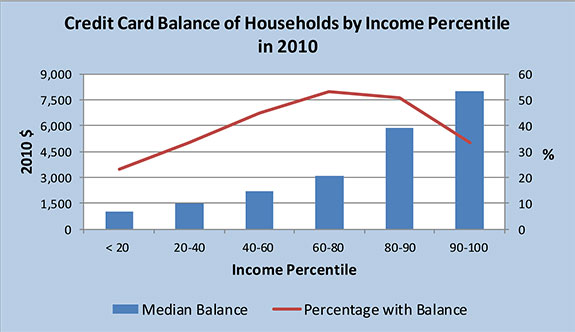
Now here is a chart representing the shares of families with outstanding credit card balance, in each income percentile, and the median value of those balances, again in 2010 dollars. As you can see, the highest shares of families with outstanding credit card debt are seen in the mid-income ranges, whereas, as should be expected, the highest median amount of credit card debt increases pretty much in lock-step with the increase of household income.
Who Holds Our Debt?
And now here is what I think is the most interesting part of the report. The above-mentioned Z.1 report provides data showing the levels of consumer debt held by several sectors. Z.1 measures the outstanding amounts of home mortgages and consumer credit held as assets by government and non-government institutions. Well, below is a chart of the holders of consumer credit (excluding mortgages).
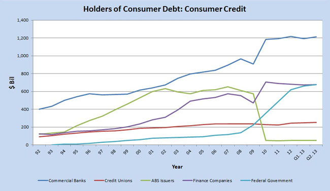
Yes, commercial banks have increased their holdings, but the federal government has seen the biggest increase. And that increase is almost exclusively the result of the spike in educational loans: since the end of 2008, when it stood at only $135.1 billion, the total of outstanding federal government loans to American consumers has increased by an astonishing 430 percent, or $580.9 billion, to reach $716.0 billion at the end of September.
Now here is the chart of the holdings of home mortgages:
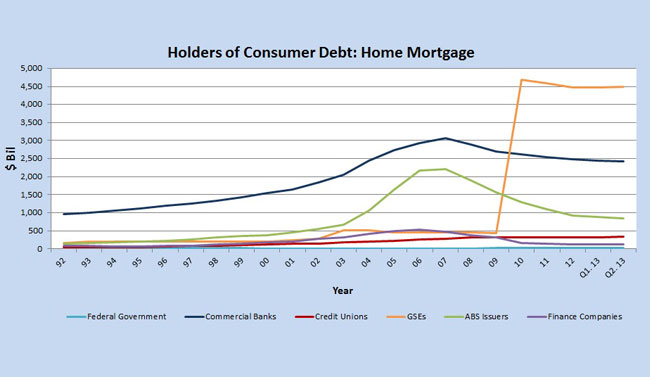
Yes, the GSEs in question are Fannie Mae and Freddie Mac. Note that the only other group of debt holders, which has seen a (slight) increase is credit unions.
No takeaways today — the charts speak for themselves.
Image credit: Flickr / Images_of_Money.


