Owing Debt to the U.S. Government

The Federal Reserve Bank of Philadelphia’s Payment Cards Center Consumer Statistics page gives us the latest data and trends on consumer credit payments. It is an invaluable resource for those of us who’ve made it their job to keep track of the evolving U.S. consumer credit landscape. For while it is true that we do have many other great sources of data to tap, not least those maintained by other Federal Reserve outfits (such as the Z.1 and G.19 reports), the Philadelphia Fed Payment Cards Center is saving us a lot of time by crunching the raw data for us every quarter.
So today I will give you the Payment Cards Center’s latest snapshot of consumer debt, credit performance, and supply and demand of credit in the U.S. By and large, you will find the picture it paints a quite familiar one and there really is nothing in the data that bucks any of the post-Lehman trends. Yet, there are a couple of graphs, which I’ve singled out before, that stand out.
Again, this is not because they illustrate some new trends, but rather because of the huge scale of the underlying shifts that have taken place in the post-crisis years and are still well under way. So let’s take a look at the latest data on the holdings of consumer debt that belong to the U.S. government and government-sponsored enterprises (GSEs).
The Debt We Owe
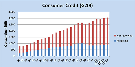
The total amount of outstanding consumer credit is broken down into two segments in the Federal Reserve’s G.19 report: revolving and non-revolving credit. The former category is made up almost exclusively of outstanding credit card balances, while the latter is a varied mixture of student loans, auto loans and loans for mobile homes, boats and trailers, but not including home mortgages and loans for other real estate-backed assets.
As you can see in the chart below, whereas revolving credit declined quite a bit in the first two post-crisis years and has remained virtually flat since then, the non-revolving component of the total didn’t fall nearly as much and then it was much quicker to rebound. As a result, the total amount of consumer credit has been rising steadily since 2010.
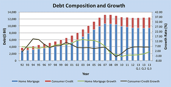
The Federal Reserve Flow of Funds Accounts (the Z.1 report) gives us data on debt growth and debt outstanding in several sectors. Below you can see the chart for the growth of home mortgages and consumer credit.
Charge-offs, Delinquencies and Bankruptcies Keep Falling
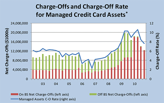
The Federal Reserve Board takes its charge-off data from the Report of Condition and Income (Call Report), which is filed quarterly by all commercial banks. For any loan category in the report, charge-off rates are calculated as the flow of a bank’s net charge-offs (gross charge-offs minus recoveries) during the quarter divided by the average level of its outstanding loans for that period. Below are the charts for the charge-off rates and volumes for each of the major consumer credit categories.
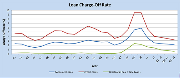
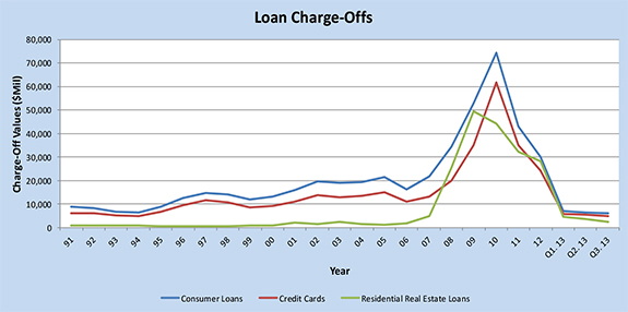
The chart below is produced from data taken from the above-mentioned Call Report and illustrates the shifts in the charge-off rate, calculated by dividing the total of on- and off-balance-sheet credit card net charge-offs (gross charge-offs minus recoveries) during the quarter under examination by the on- and off-balance-sheet total amount outstanding for the end of the previous quarter.
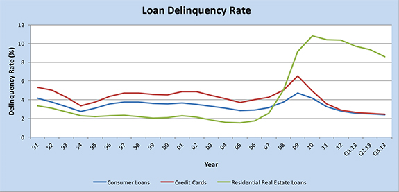
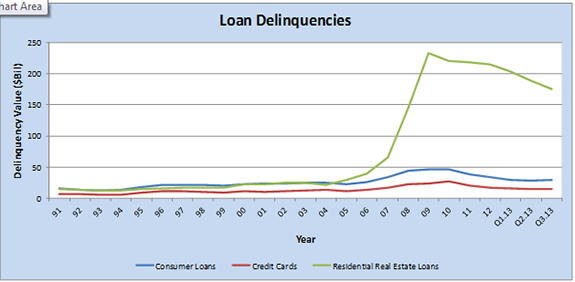
The Federal Reserve’s Board calculates delinquency statistics also from data available in the Call Report. The delinquency rate for any loan category is measured as the ratio of the dollar amount of a bank’s delinquent loans in the category under examination to the dollar amount of the total loans outstanding in that category. Below are the charts for the delinquency rates and delinquent volumes for each of the major consumer credit categories.
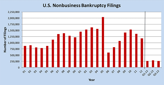
Bankruptcy filings are calculated using data from the Administrative Office of the United States Courts. The chart below shows the steep decline last year in the bankruptcy filings by non-business entities. The spike of bankruptcies in 2005 was due to the Bankruptcy Abuse Prevention and Consumer Protection Act (BAPCPA), which went into effect on October 17, 2005.
Credit Standards Remains Tight, but Demand for Loans Keeps Rising
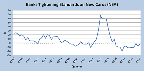
The data used to keep track on the banks’ credit standards and demand for consumer loans are taken from questions asked by the Federal Reserve in its Senior Loan Officer Opinion Survey (SLOOS). Surveyed are around 60 large domestic banks and 24 U.S. branches and agencies of foreign banks. The respondents answer questions that cover changes in the standards and terms of their banks’ lending and the state of business and household demand for loans and some other topics.
As illustrated in the chart below, following a huge tightening in the hectic months around the financial meltdown of 2008, U.S. banks proceeded to quickly relax their lending standards, which is a trend that has then continued uninterruptedly through the post-crisis period.
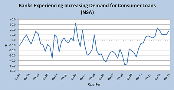
The ongoing loosening of the lending standards has lately been accompanied by an increase in demand for consumer loans, which is now coming close to the peak level reached in 2003.
The More We Earn, the More We Owe
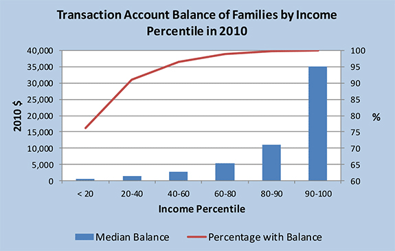
The triennial Survey of Consumer Finances (SCF) gathers data of the balance sheet, pension, income and other demographic characteristics of U.S. families. These data are then used to calculate the outstanding credit card balances of families segmented by income level. The first chart below shows the median value of transaction accounts for families with such accounts, in 2010 dollars. As one might expect, families in the higher income percentiles have higher available balances.
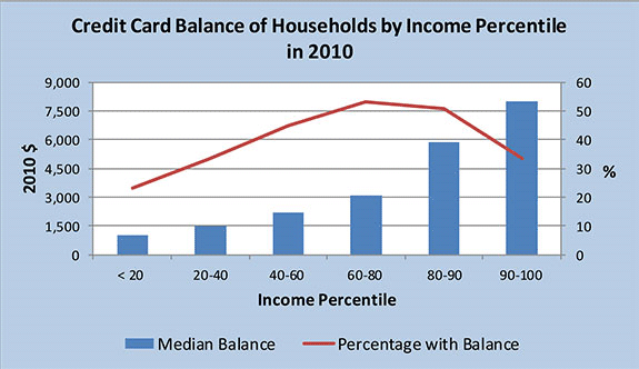
Now here is a chart showing the shares of families with outstanding credit card balance, in each income percentile, and the median value of those balances, once again in 2010 dollars. As you can see, the highest shares of families with outstanding credit card debt are found in the mid-income ranges, whereas, as one would expect, the highest median amount of credit card debt increases pretty much in lock-step (and quite significantly) with the increase of household income.
Owing Debt to the Government
And now we come to the most interesting part of the Payment Cards Center’s report. The above-mentioned Z.1 report gives us data showing the levels of consumer debt held by several sectors. Z.1 measures the outstanding amounts of home mortgages and consumer credit held as assets by government and non-government institutions. The chart below breaks down the holders of consumer credit (excluding mortgages).
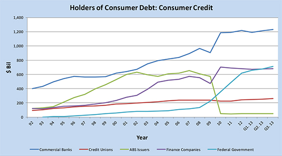
While commercial banks have expanded their holdings of consumer debt, the federal government has seen the biggest increase. And that increase is almost exclusively the result of the huge spike in educational loans: since the end of 2008, when it stood at only $135.1 billion, the total of outstanding federal government loans to American consumers has increased by an astounding 460.9 percent, or $622.7 billion, to reach $757.8 billion at the end of January.
Finally, here is the chart of the holdings of home mortgages:
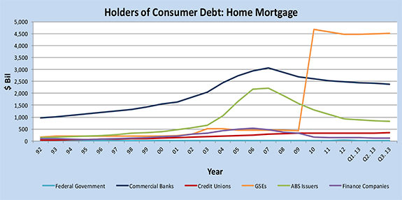
The GSEs in the chart are, of course, Fannie Mae and Freddie Mac. You will note that the only other group of debt holders, which has seen an (almost imperceptible) increase in their holdings, is credit unions.
I offer no takeaways today — the charts tell the whole story.
Image credit: Flickr / LendingMemo.

