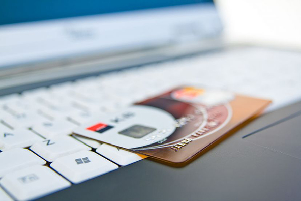
Managing Payment Choices at the E-Commerce Checkout

Have you noticed how quickly the number of available payment choices on e-commerce websites is proliferating? While credit cards are still the predominant customer choice, there are now all kinds of credit-based options for customers to choose from, including Bill Me Later and eBillme. Multiple providers offer electronic check acceptance. PayPal, Amazon Payments and Google Checkout allow consumers to consolidate all of their payment accounts, including credit cards and checking accounts and manage them all from one point of access. There are also the payment options of the “unbanked,” such as Western Union and MoneyGram.
Merchants have learned that offering multiple choices at the checkout helps attract new customers and reduces the number of lost sales at the last moment, when consumers would walk away if they didn’t see their favorite option. While offering multiple payment choices is great, you would also want to make sure that your checkout process makes it simple for customers to make their payment selections and avoids the confusion that can often arise when options are plentiful.
There are a number of ways in which a customer can get confused when selecting a payment method. For example, options such as “Debit” and “Credit” can be misleading, as their meaning may be interpreted differently, depending on the customer’s understanding. On the other hand offering the option of selecting a payment brand gives your customer a clear payment choice. It is easy to distinguish a Visa card from a MasterCard or a Discover. You should consider placing a menu of radio buttons for each card brand that your checkout account supports. Additionally, you should consider placing each card brand’s logo next to its button. Also, you would want to keep the various forms of payment separate from one another. Credit cards should be grouped together, separate from bank accounts, which in turn should be kept separate from Bill Me Later and eBillme, etc.
When your customer makes a payment selection, you must honor it. Some payment choices are costlier for you to accept than others, however once you make a decision to support the more expensive forms of payment, you have to stick to it. It is perfectly acceptable to suggest a form of payment or to display your preferred choice, but you cannot mislead or confuse the customer or omit important information in the process. Your customer has the right to use whatever payment method he or she chooses, provided it is supported at the checkout, and once the selection is made, you are required to facilitate the processing of the transaction.
Merchants are not allowed to charge customers additional fees for payments made with credit or debit cards, in order to make up for the associated processing costs. It is allowed, however, to offer a discount if a customer selects to pay in cash, for example, or in any other way that the merchant chooses. Additionally, if a merchant accepts card payments, cards should be accepted for all amounts. It is not allowed to set limits on transaction amounts for card payments. You can lose your merchant account if you do not comply with these requirements.
The most important thing to remember when designing your website’s checkout pages is that the checkout is where you close the sale. Your customer has already made a decision to buy and all you have to do is take the payment. However, if your customer feels like he or she is being misled or otherwise mistreated at the checkout, you will lose the sale. Keep the process simple and straightforward and be sure to play by the rules.
Image credit: Eventmoneymachineblog.com.


